Most advice about office colour schemes treats colour as decoration pick something that looks sharp in the brochure and move on. Vastu Shastra asks a different question: what is this room actually for, and does the colour around it support that work or fight against it? A finance team doing detailed, high-stakes reconciliation needs a different visual environment than a design studio trying to generate ten loose ideas before lunch. Once you start sorting by function instead of just aesthetics, the right Office Colour Combinations become a lot more obvious.
This guide walks through colour combinations grouped by what kind of work happens in the space, with the Vastu reasoning behind each one and the practical trade-offs worth knowing before you commit to a wall colour you'll be looking at for the next five years. Much of this logic carries over directly from how people think about house colour combination choices at home the same directional principles apply, just adapted to the rhythms of office life rather than domestic ones.
A Quick Grounding in the Vastu Logic
Vastu ties colour recommendations to direction and element. Each cardinal direction is associated with an element and a set of qualities, and the idea is to choose colours that reinforce rather than clash with that direction's energy.
North is linked to growth and opportunity, which is why greens do well there. East favours clarity and new beginnings, so whites, creams, and light blues tend to suit east-facing rooms. South is associated with fame, recognition, and fire energy, which pairs naturally with warm terracottas and earthy reds. West leans toward gains and stability, often paired with blues, greys, and other grounding neutrals. The north-east corner is treated as a particularly sensitive zone tied to wisdom and clarity, so it's usually kept light whites, ivories, very pale tones while the south-west, linked to stability and long-term decisions, takes well to heavier earth tones like browns and beiges. Understanding vastu zones and colours at this level direction first, function second is really the foundation everything else in this guide builds on.
None of this is a rigid rulebook. A west-facing legal office painted entirely in fire-red wouldn't collapse, but it would be working against the grain of the room rather than with it. Think of these as defaults to lean on, not constraints to force.
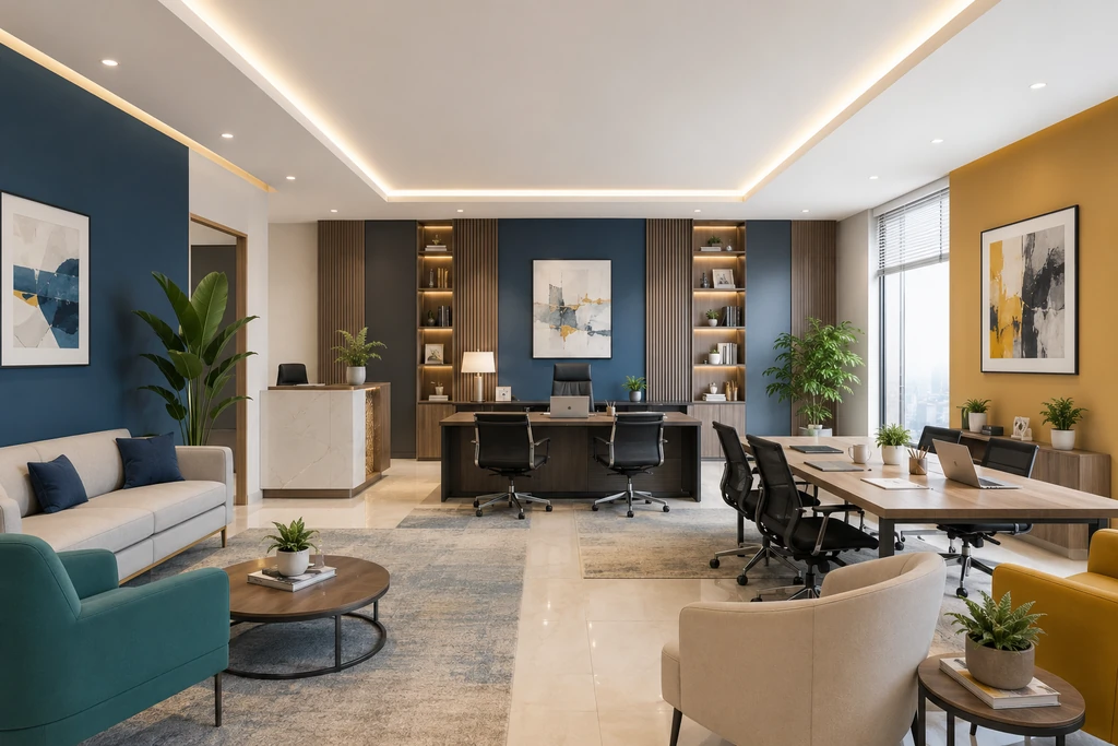
For Spaces Where People Form First Impressions
Reception areas and client-facing rooms carry more weight than their square footage suggests they're often where a client's opinion of your business gets set before anyone says a word.
Blue and white remains the standard choice here for a reason. Blue carries associations with trust and competence that show up consistently in colour psychology research on professional environments, and white keeps a small reception area from feeling closed in. The combination reads as composed without being cold, which is exactly the impression most client-facing teams want to make. It also happens to align with Vastu's west-direction guidance, where blue tones support stability in business relationships.
If your brand leans warmer or more personal counselling practices, HR-led onboarding spaces, boutique consultancies beige and teal does something blue and white can't: it adds a current of creativity and calm without losing the neutrality that makes a space feel safe to walk into. Teal is harder to get right than blue because it can tip toward either too cool or too saturated depending on the light, so test a sample patch under your actual office lighting before committing a whole wall to it.
For Rooms Where Decisions Get Made
Boardrooms and executive offices have a specific job: they need to convey authority without intimidating the people in the room, because the best decisions usually come from people who feel comfortable speaking up.
Navy blue and light grey threads that needle well. Navy alone can feel heavy in a windowless boardroom, but pairing it with light grey on the opposing walls or trim keeps the room from closing in. This is one of the few combinations that genuinely earns the word "timeless" it looked appropriate for a boardroom a decade ago and it'll look appropriate a decade from now, which matters if you're not planning to repaint often.
For a slightly more commanding register legal chambers, high-stakes negotiation rooms navy blue and gold brings in a sense of prestige that pure navy-and-grey doesn't. The gold needs to stay restrained, though: a gold accent wall or trim detail works, but gold as a dominant tone tips the room from "confident" to "ostentatious" fast. Used sparingly, in frames, hardware, or a single feature wall, it adds weight without overplaying it.
If your decision-making spaces lean toward sustained, detail-heavy work rather than persuasion finance reconciliation, audit review, long planning sessions charcoal grey and beige is the better fit. Charcoal grey is more serious than navy and reads as more focused, while beige stops the room from feeling cold during the long hours these teams tend to put in.
For Creative and Collaborative Work
Creative teams generally need permission to be a little louder than the rest of the office, but there's a real difference between energising and distracting, and that line gets crossed more often than people expect.
Grey and yellow is probably the most balanced option for studios and co-working areas. Yellow alone, applied across large surfaces, has a documented tendency to cause eye fatigue and irritability over long exposure it's one of the few colour effects with decent supporting evidence rather than just folklore. Grey absorbs that intensity. The practical version of this combination uses yellow as the accent (a single wall, furniture, signage) and grey as the dominant tone, not the reverse.
Light purple and grey works for teams doing more conceptual, ideation-heavy work early-stage product thinking, brand strategy, anything where the goal is generating unusual associations rather than executing a known plan. Purple has a long association with imagination in colour theory, though it's a polarising colour personally, so it's worth checking with the actual team before committing a shared space to it rather than assuming everyone reads it the same way.
For teams that want energy without abstraction marketing, sales-adjacent creative work orange and white keeps things lively while staying legible and professional in front of clients who might wander through.
For Wellness, HR, and Quieter Spaces
Rooms meant for sensitive conversations HR offices, wellness rooms, counselling spaces need to feel safe before anything else.
White and pastel pink is the gentlest combination on this list, and it earns that gentleness rather than just defaulting to it: pink's association with compassion and emotional softening is one of the more consistently observed effects in environmental colour psychology, though it's worth noting it can read as overly soft in a context that also needs to feel credible (an HR office handling a serious grievance, for instance). Pairing it with white rather than a deeper pink keeps the room calm without undercutting the seriousness of what might be discussed there.
Green and brown takes a more grounded approach to the same goal. Rather than softness, it leans on stability green's link to renewal and brown's link to security combine into a room that feels settled rather than fragile, which suits wellness spaces aimed at longer-term support rather than one-off difficult conversations.
Where the Vastu Layer Actually Matters Most
If you're applying Vastu seriously rather than just borrowing colour ideas from it, the direction of the room matters more than the room's function. A north-facing HR office and a north-facing boardroom both benefit from green undertones, because the direction's energy applies regardless of what the room is used for the function just tells you how to balance it (more saturated green for the HR space's warmth, a muted sage for the boardroom's restraint).
The north-east corner deserves particular care. Vastu treats it as the most sensitive zone in any layout, tied to clarity and wisdom, and the standard guidance keep it light, avoid heavy darks holds regardless of what's happening in that corner. If your reception desk or your CEO's office happens to sit in the north-east, that's reason enough to lean toward white, ivory, or pale cream rather than the deep charcoal that might otherwise suit an executive space.
A Few Things Worth Skipping
Some colour choices come up often enough in office design conversations that they're worth flagging directly. Saturated neon tones, however energising they look in a mockup, tend to cause measurable visual fatigue when employees sit near them for eight hours a day they're better as small accents than wall colours. Black used across large surfaces reads as heavy and can make a room feel smaller than it is, which matters more in compact offices than in cavernous ones. And red, while a legitimate accent colour for sales or marketing spaces where you want urgency, rarely works as a dominant tone it's been linked in several studies to increased stress responses with prolonged exposure, which isn't what you want humming in the background of someone's whole workday.
The Short Version
Match the colour to the work, not just the brand. Trust-building spaces lean blue and white or beige and teal. Decision-heavy rooms do well with navy, grey, and charcoal, with gold reserved for accents in higher-stakes settings. Creative spaces benefit from grey-anchored yellow or purple rather than full-saturation versions of either. Sensitive spaces lean toward pink or green-brown depending on whether the goal is softness or grounding. And if you're following Vastu directionally, let the room's compass orientation set the undertone, then adjust the saturation for what actually happens inside it.
None of this is about getting a "correct" answer it's about making a deliberate choice instead of an accidental one when picking among Office Colour Combinations for your space. A colour scheme chosen on purpose, for a reason you could explain to someone standing in the room, tends to hold up a lot better than one picked off a trend board.
Posted By

Saria George
info@houssed.com
Saria George is a home décor writer at Houssed who focuses on interior design, décor trends, furniture, and practical ideas for modern living spaces. Her work highlights simple design choices that balance comfort, functionality, and aesthetics.