Choosing exterior colours feels like one of those little decisions, until you’re actually standing right in front of the paint swatches and realizing, how different an “off-white” can be depending on which off-white you mean. It’s not only about what looks good on a colour card, the right house colour pairing can really lift curb appeal, help your home harmonize with its surroundings, and even nudge how potential buyers feel about the place if you ever decide to sell. Here’s a practical way to think through the combinations to consider this year, kinda grouped by the mood they create rather than just being shoved at you as a flat list.
Classic and Timeless Pairings
Some combinations never really go out of style,and honestly there’s a good reason for it. They just work with almost any architecture ,and they seem to age well rather than looking dated in five years
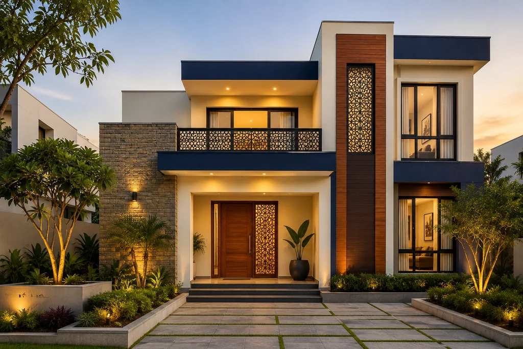
White and navy blue is the obvious starting point, it fits coastal and colonial-style homes especially well, and it pairs up nicely with accents like gold, wood tones, or even grey. Chocolate brown with light grey is another solid option for urban settings, it feels grounded, and also pretty sophisticated without forcing the issue. Charcoal grey and white gives that crisp contrast for anyone who wants something a bit more dramatic but still pretty safe, especially if the building is minimalist
Earthy and Nature-Inspired Tones
If your home sits close to greenery, hills, or open land, leaning into earthy tones usually looks more intentional than fighting against the landscape with bright colours.
Terracotta and ivory brings warmth and a rustic, Mediterranean feel that blends into outdoor surroundings. Earthy brown and beige is quieter a safe, neutral palette for homes that want to feel calm rather than make a statement. Beige and forest green leans further into this, suiting properties surrounded by trees or gardens, while olive green and cream gives a more refined, rural-suburban version of the same warmth.
Coastal and Calming Combinations
There's a reason so many beach houses default to blue it just works, and it photographs well in almost any light.
Blue and sandstone beige captures that relaxed, nautical feel without being too literal about it. Sandstone beige and light blue is a gentler variation, good for lakeside or coastal properties wanting calm over drama. Sea green and off-white leans further into the ocean palette, while turquoise and white goes brighter and more tropical if your climate can support a more playful look.
Bold and Contemporary Statements
Not every home wants to blend in. If you're building something architecturally distinct, a bolder palette can actually be the smarter choice.
Steel grey and bright orange is a strong, modern pairing that works well on homes already leaning into clean, angular design. Burnt orange and charcoal grey achieves something similar but slightly warmer and less aggressive. Silver grey and bright red is best used sparingly, as an accent on a front door or trim, since it can overwhelm a large surface. Slate grey and mustard yellow rounds this group out nicely for homes that want personality without going full primary-colour.
Warm and Vibrant Choices
These combinations suit homes in warmer climates or anyone who wants their entrance to feel energetic rather than restrained.
Brick red and cream is the classic version of this warm, characterful, and especially suited to heritage-style homes. Sunset orange and pearl white achieves a similar warmth with a more contemporary edge, good for family homes that want to feel welcoming. Rust and pale yellow works well in arid regions, leaning into a southwestern aesthetic, while peach and olive green softens that warmth into something more garden-inspired.
Soft and Romantic Palettes
For homes that want charm over drama, softer pastel-adjacent combinations tend to do the job better than anything too saturated.
Rose pink and white is the obvious choice here, suited to cottages and vintage-style homes looking for a delicate, nostalgic feel. Lavender and dove grey is similarly calm but a touch more sophisticated, working well for modern minimalist exteriors too. Pastel peach and mint green brings more youthful energy into the mix, particularly nice for coastal or boho-leaning homes.
Luxury and Statement Tones
If the goal is to signal a bit of grandeur, certain combinations do that more convincingly than others.
Black and gold remains the most reliable choice for this bold, confident, and well-suited to upscale residences that want to look deliberately impressive. Gold and ivory softens that luxury into something more classical, elegant without the same visual punch. Deep purple and off-white sits in between, regal without being overdone.
Practical Tips Before You Commit
A few things matter more than the colour names themselves once you actually get to choosing a house colour combination. Look at what's already around your home trees, soil, neighbouring houses, the sky on a typical day and decide whether you want your palette to blend in or stand apart. Match the combination to your architecture rather than just to a trend; classic homes generally suit classic pairings, while bolder, more angular builds can handle stronger contrast. Test any shortlisted colours in actual daylight at your site rather than trusting a swatch indoors, since natural light changes how a colour reads more than people expect. The 60-30-10 rule is worth following too 60% dominant colour, 30% secondary, 10% accent since it keeps even a bold palette from feeling chaotic. And try to pick something you'll genuinely enjoy in five years, not just something trending this season, since repainting a whole exterior isn't a small job.
It's also worth thinking beyond colour alone if you're still finalizing layout decisions for instance, anyone working with 800 sq ft house plans with vastu often finds that certain exterior tones pair more naturally with compact, vastu-aligned layouts than others, simply because of how light and entrance placement interact with the facade.
Choosing What Actually Fits Your Home
There's no universally "right" answer here only a house colour combination that suits your specific architecture, climate, and the mood you're going for. A heritage home rarely needs a bold contemporary palette to look good, and a sleek modern build usually doesn't need rustic earth tones to feel warm. The better approach is picking the category that matches your home's character first, then narrowing down the specific shades from there, ideally tested in real daylight before any paint actually goes on the wall.
And if you're renovating room by room rather than just the exterior, it's worth checking smaller details too, since something as specific as toilet seat direction as per vastu still gets factored into broader home planning by people who like to align every part of the house, not just the colour scheme, with a consistent design philosophy.
Posted By

Saria George
info@houssed.com
Saria George is a home décor writer at Houssed who focuses on interior design, décor trends, furniture, and practical ideas for modern living spaces. Her work highlights simple design choices that balance comfort, functionality, and aesthetics.