Have you ever walked into a room and instantly felt at ease without being able to explain why? Or stepped into a space that felt heavy and uncomfortable despite looking perfectly fine? A lot of that has to do with colour. And in Vastu Shastra, colour is taken very seriously.
Choosing the right Vastu Shastra colours for your living room isn't about following rigid rules. It's about understanding how different shades interact with the natural energy of a space and using that knowledge to create a home that genuinely feels good to live in. Whether you're repainting from scratch or just looking to make a few tweaks, this guide will help you make confident, informed choices.
Why Colour Actually Matters in Vastu
Most of us pick wall colours based on what looks good in a showroom or matches the sofa. But Vastu Shastra approaches colour quite differently it connects each shade to one of five natural elements, and each element governs a specific kind of energy in your home.
Here's how that breaks down:
- Earth (brown, beige): Creates a sense of stability and emotional groundedness
- Water (blue, sea green): Encourages calm, flow, and clarity
- Fire (red, orange): Brings energy, warmth, and motivation
- Air (white, light grey): Promotes openness, movement, and fresh thinking
- Space (purple, violet): Supports intuition, spirituality, and inner growth
The living room is where your family gathers, guests are welcomed, and conversations happen. When the colours in that space align with the right elements, you'll often notice a subtle but real shift in how the room feels and how people behave in it. To understand how this works across the rest of your home too, take a look at this deeper guide on Vastu Zones and Colours.
Best Vastu Shastra Colours for the Living Room
There's no single "perfect" colour for every living room. The right choice depends on your room's direction, size, and the kind of energy you want to encourage. That said, these shades consistently come up as the most effective and versatile choices.
Off-White and Cream
If you're unsure where to start, off-white is almost always a safe and smart choice. It reflects natural light beautifully, makes smaller rooms feel more open, and works as a base that complements virtually any accent colour. It's also one of the few shades that works well regardless of which direction your living room faces making it ideal if you're not sure about the orientation of your space.
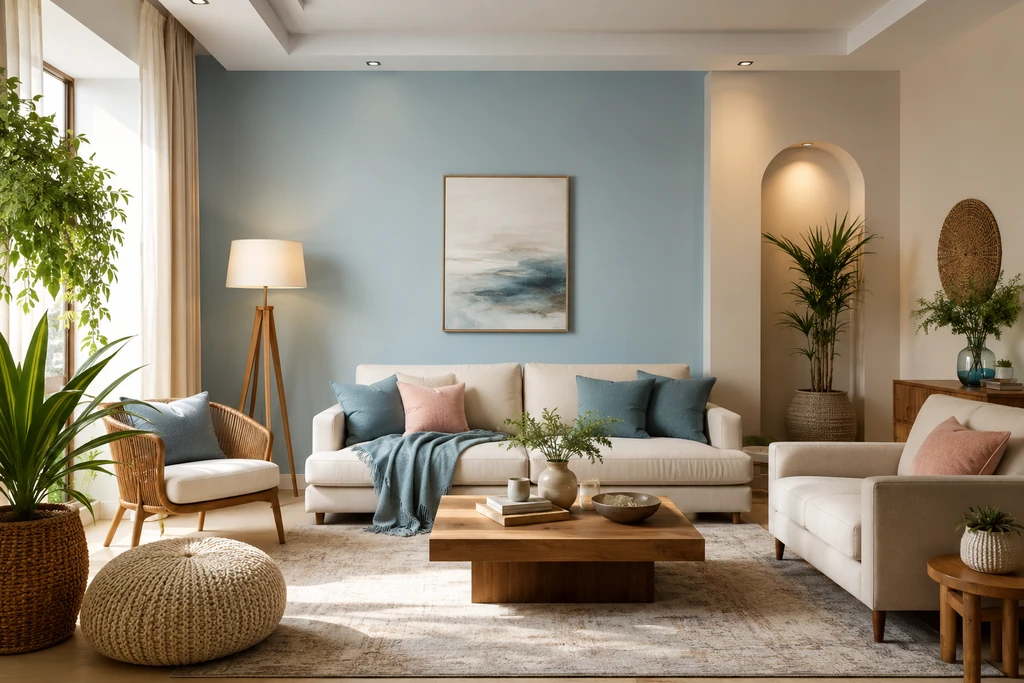
Soft Blue
There's something about a muted, dusty blue that just feels calming. It slows things down, encourages honest conversation, and creates the kind of atmosphere where people feel comfortable settling in. Vastu recommends it for north or east-facing walls, and it pairs particularly well with white and warm wooden textures.
Sea Green
Sea green sits right at the intersection of nature and calm. It carries the freshness of the outdoors and a quiet, cleansing energy that works especially well in north-east facing rooms. If your living room gets good morning light, sea green walls can feel genuinely uplifting. Try pairing it with white or soft pastel pink for a light, airy combination.
Light Grey
Grey gets a bad reputation for being cold or clinical, but the right shade of light grey is actually quite grounding and elegant. It represents the air element in Vastu encouraging mental clarity and a sense of ease. It works best in north-west or west-facing rooms, and the key is to balance it with warm accent tones like beige, terracotta, or natural wood to stop it from feeling too sterile.
Earthy Browns and Beige
These tones feel like home. Browns and beiges connect to the earth element, which is all about stability and rootedness qualities that every living room benefits from. They're particularly recommended for south-west facing spaces. Shades like taupe, warm sand, and light coffee create a cosy, welcoming atmosphere that naturally puts people at ease.
Soft Pink
Pink sometimes gets dismissed as too feminine or bold, but a soft, muted pink is actually quite gentle and emotionally warm. It encourages feelings of love, compassion, and ease all things you want in a space where family members spend time together. Blend it with white to keep it light and airy rather than overwhelming.
Lavender and Soft Purple
Deep purple can feel heavy and spiritually intense, but softer tints like lavender and lilac bring a very different energy one of quiet intuition, creativity, and calm. In Vastu, purple connects to the space element, making it a good choice for meditation corners or feature walls. Just steer clear of very deep or saturated purples in compact rooms, as they can make the space feel smaller and heavier.
Red but Only as an Accent
Red is powerful. In Vastu, it represents fire energy passion, drive, and strength. Used sparingly, it adds life to a room. Used too broadly, it creates tension and restlessness. Keep red to cushions, artwork, a decorative vase, or at most a single accent wall. That way you get the energy without the overwhelm.
Which Colour Suits Your Room's Direction?
This is probably the most practical piece of Vastu advice when it comes to living room colours. The direction your room faces tells you a lot about which element governs that space and which colours will feel most natural and supportive there.
| Direction | Colours That Work Best | The Logic Behind It |
|---|---|---|
| North | Light blue, white, cream | Water element; calm, clarity, financial flow |
| East | Light green, soft yellow, off-white | Air element; fresh starts, health, vitality |
| South | Terracotta, orange, earthy red | Fire element; energy, enthusiasm, strength |
| West | White, grey, soft blue | Supports relaxation and quiet reflection |
| North-East | White, light blue, light green | Highly auspicious; spiritual clarity and growth |
| South-West | Brown, beige, cream | Earth element; stability, security, warmth |
If you don't know which direction your living room faces, a basic compass app on your phone will tell you in seconds. It's worth checking before you commit to a colour.
Colour Combinations That Actually Look Good Together
Vastu doesn't mean you're stuck with a single flat colour on every wall. In fact, layering colours thoughtfully walls, furniture, textiles, and accents tends to produce much better results than trying to create a monochrome space.
Blue and White this combination is clean, calm, and effortlessly modern. It's especially well-suited to west or north-west facing rooms. Bring in natural textures like jute cushions, linen curtains, or a cane chair to keep it from feeling too minimal.
Soft Yellow with White or Grey yellow brings a warmth and cheerfulness that's hard to replicate with any other colour. Paired with white or soft grey, it stays uplifting without tipping into loud or garish. A great choice for east or north-east facing rooms.
Orange, Brown, and White this trio feels earthy and alive at the same time. Orange brings vitality, brown keeps it grounded, and white stops it from feeling too heavy. It works particularly well in south or south-east facing rooms and sits beautifully with wooden furniture.
Green and Blue if you love the feeling of being close to nature, this combination is hard to beat. Green brings growth and healing; blue brings serenity. Together they create a space that feels genuinely restorative. Even better when you add a few indoor plants.
Colours Worth Avoiding
Just as some shades enhance the energy of your living room, others can quietly work against it. These aren't hard prohibitions, but in large quantities on dominant walls, they tend to create more problems than they solve.
Dark Red is the main one to be cautious about. While a touch of red energises a room, too much of it creates an undercurrent of tension and agitation. A red accent here and there is fine an entire red wall, not so much.
Black absorbs both light and energy. A little black in décor can add sophistication, but large black walls or furniture-heavy spaces can start to feel oppressive and stagnant over time.
Dark Grey, unlike its lighter counterpart, tends to feel emotionally heavy. It can make a room feel dull and sluggish. If you love grey, just go lighter dove grey or ash grey give you the same cool tone without the weight.
Navy or Deep Blue creates a similar problem to dark grey it can make a space feel cold, distant, and isolating. Keep deep blue to small decorative details rather than full walls.
Deep Purple can be overwhelming in small or dimly lit rooms. If purple speaks to you, stick to lavender or lilac, which carry a much lighter, airier energy.
Practical Tips for Applying Vastu Shastra Colours
Knowing the theory is one thing actually applying it well in your home is another. These are the practical habits that make the biggest difference.
Start with direction. Before you open a paint catalogue, figure out which direction your living room faces. Everything else flows from that. It's a one-minute check that saves a lot of second-guessing later.
Go lighter than you think you need to. Paint always looks darker on a full wall than it does on a swatch. If you're choosing between two shades, generally go with the lighter one it'll reflect more light and keep the energy of the space open and fresh.
Think of your walls as a backdrop, not a statement. Bold, dramatic wall colours are tempting in showrooms, but they compete with everything else in the room. Let your wall colour be the calm base from which your furniture, textiles, and accents do the talking.
Don't neglect your walls' condition. Vastu is quite clear on this faded, chipped, or peeling paint disrupts energy flow just as much as the wrong colour does. If your walls are looking tired, even the most Vastu-perfect colour won't do much. Refresh the paint every few years.
Bring in natural elements alongside your colour. A few indoor plants, a small water bowl, candles, or a wooden sculpture work with your colour palette to reinforce the Vastu elements in the space. It doesn't need to be elaborate even a single potted plant in the right corner adds something real.
A Practical Do's and Don'ts Summary
Do:
- Use light, soothing shades as your primary wall colour
- Match your colour choice to the direction your room faces
- Bring in warm accent colours orange, red, yellow in small, intentional doses
- Blend warm and cool tones so the room feels balanced rather than one-dimensional
- Keep your walls clean and well-maintained
- Let natural light work with your colour palette, not against it
Don't:
- Cover large walls in black, dark grey, or deep red
- Paint all four walls in the same intense or saturated shade
- Choose a colour purely based on trends without considering your room's direction
- Layer too many contrasting colours it creates visual noise that disturbs the energy
- Ignore maintenance a beautiful colour on chipped, neglected walls does more harm than good
Final Thoughts
Getting Vastu Shastra colours right in your living room really doesn't have to be complicated. The core idea is simple: lighter, element-aligned shades in the right directions create spaces that feel naturally good to be in. You don't need to repaint every wall overnight. Start with one change maybe it's switching a dark feature wall to something softer, or adding a sea green accent to a north-east corner and see how the room responds.
Small, thoughtful changes make a genuine difference. And if you want to extend these principles to the rest of your home, the entry point is just as important as the living room so it's worth exploring Southeast Entrance Vastu to make sure the energy entering your home is setting the right tone from the start.
Posted By

Akshay Gupta
info@houssed.com
Akshay Gupta writes about lifestyle and modern living for Houssed, focusing on practical décor ideas and everyday comfort. His work offers simple guidance to help readers create functional and welcoming home environments.